Case study · Expensa · Self-directed
An expense app my wife and I actually use.
Yes, another expense tracker — I know. The difference is this one is fully mine: I designed it, made every product call, wrote the code, and do the marketing. It's live on the App Store in eight languages, and strangers actually pay for it.
- Role
- Solo — product, design, iOS, AI
- Platform
- iOS · SwiftUI · CloudKit
- Timeframe
- Built in 2025, shipped April 2026
- Status
- Live on the App Store · 8 languages
01
The problem
My wife and I wanted to see where our shared money goes (well, mostly my wife 😄). Before building anything, I went through the popular apps to see what was already out there — and most of them shared the same problems.
Some were strong on features but weak on the UX and UI. Others looked nice but couldn't really do the job. Almost all of them made you create or connect an account before you could even start. The few built for couples weren't really shared either — one person owned the data, the other could only look. And once you had a few accounts in different currencies, just logging one expense turned into work: pick the account, deal with the currency, keep it all straight. That friction is what makes people quit a finance app.
I'm a designer, so for me it's not only about how an app looks — the flow, the small interactions, and how it feels every day matter just as much. None of these felt right.
So I set a simple goal: an app that looks good, that two people share with no setup, and where adding an expense takes one second.
02
Product decisions
These decisions didn't come from a research deck. They came from a real need — I was the user, every day, with my wife — and from the gap I kept seeing in every other app. The test wasn't a study; it was whether we kept using it. Now it's whether strangers pay to keep it. The calls that mattered, as problem and answer:
Setup
Sharing
Manual entry
What I left out, on purpose: linking your bank account. It's powerful but heavy — setup, privacy, and real cost to build and run. Apple Pay and Shortcuts give the same automatic capture without a backend or a bank connection, which fits two people who just want to see where their money goes.
03
A closer look: hands-free capture
Catching a spend on its own — no typing — came down to two problems: working out the category, and not handing the work back at the till.
The category
At the till
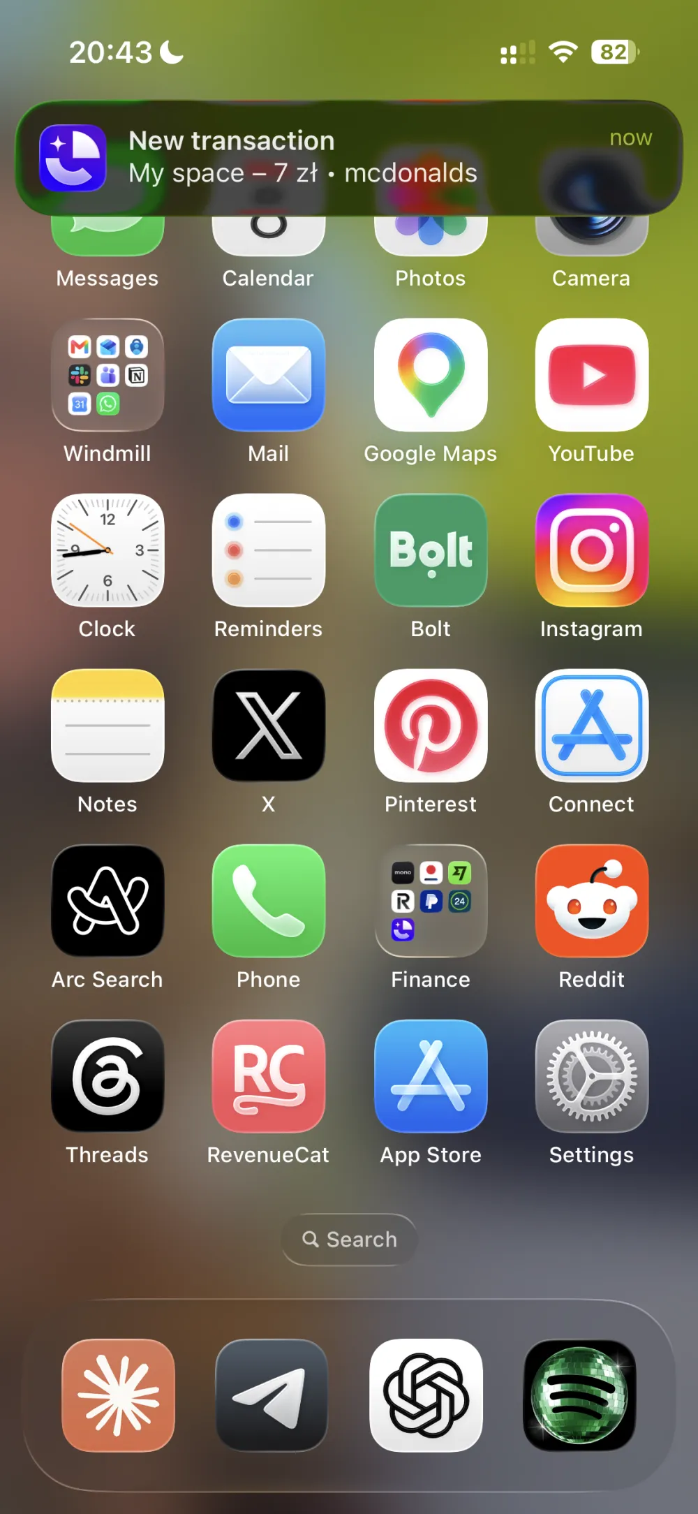
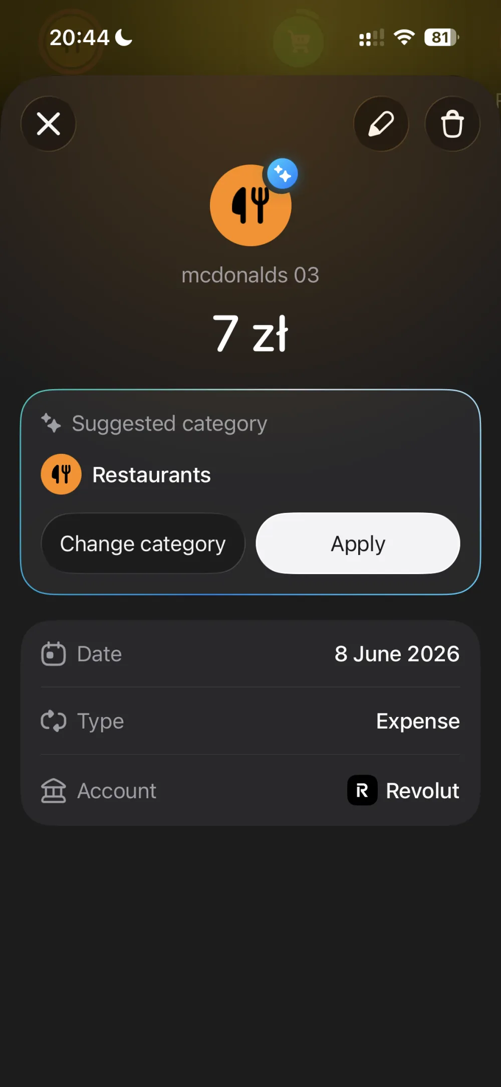
A real payment at the till, and the two screens it produces: the spend arrives as a notification, then opens with the category — Restaurants — already suggested, ready to apply or change.
The interface
The interactions up close — the add button opening, scanning a receipt, the lists, and the shared space.
How it landed
- 10.4% App Store conversion
- 1.34K Downloads · first 8 weeks
- 28 Paying customers
- 8 Languages
Nobody pays upfront — every customer comes through a 14-day free trial first. 28 have chosen to keep paying, and another 24 are still inside the trial.
04
Hindsight
I didn't just ask AI to build the app for me. I worked like a one-person product team: I set up a chain of AI agents to do the legwork — research, planning, and writing each feature as a GitHub issue — then I implemented them one by one and tested each on my own phone. The agents did the grunt work; the product calls, the design, and the quality bar were mine.
Working this way, I went deep into the architecture — how the app works inside, why it's built this way, and what each part costs. Now I can talk to developers in the same language. I understand that even "just show this data on a screen" is often not simple, and that every design decision has a real cost in code. So now I design with that cost in mind.
The honest miss, though, was the order I worked in. At work, design comes first — you plan it out, map every flow, and settle the UX before a line of code gets written. Here I skipped that and went straight into building, feature by feature. It cost me: I kept redoing the same screens, fixing in code what an hour on the flows up front would have settled. Next time I design the whole thing first and implement second — even when it's only me.
Back to